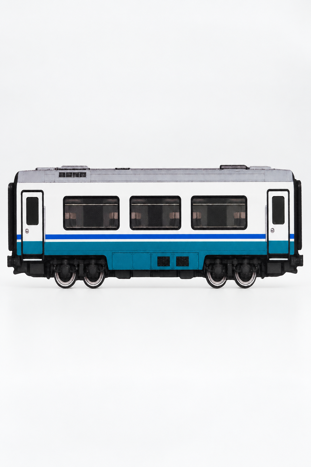
A paintable 3D graffiti practice train sits between a sketch surface, a sculptural object and a display piece. Choosing one therefore involves more than asking whether the silhouette looks good. You need to know how much usable space it offers, whether both sides can be painted, which media are supported, how the existing print affects your design and whether the object suits the way you build letters.
The right choice depends on your intended use. A writer planning a full piece has different requirements from someone testing color combinations, working on throw-ups or collecting rail-inspired urban art. This guide sets out the practical checks to make before choosing a train, using Chromatica’s German first-generation high-speed power car as a verified example.
What a 3D Graffiti Practice Train Is—and Is Not
A 3D graffiti practice train is a physical object with a rail-inspired silhouette and surfaces intended for artwork. Unlike a flat coloring page, it has form: windows, body lines, a cab shape and other printed or modeled details influence where letters sit and how the finished composition looks from different angles.
That physical form is the main attraction. You are not only drawing a train-shaped panel. You are considering how the piece relates to the nose, roofline, lower body and overall direction of the object. Once displayed, the artwork is read as part of the train rather than as an isolated rectangle.
It is also important to distinguish a practice train from three other product types:
- A scale model: A conventional scale model prioritizes proportional accuracy, miniature detailing and fidelity to a real vehicle. A practice train may instead simplify or stylize the shape to create a useful art surface.
- A coloring page or paper template: A flat template is useful for fast repetitions, photocopying and low-commitment studies. A 3D object offers a more dimensional result but cannot be duplicated as easily.
- A custom-printed object: A custom print arrives with submitted artwork already applied as part of the production process. A paintable practice train gives you a prepared base that you alter manually.
The Chromatica example is a standalone, stylized artistic interpretation of a classic first-generation German high-speed power-car silhouette. It is not scale-accurate and is not part of the Chromatica City Series. It contains no official operator logos, company names, protected model names, route markings or vehicle numbers. It is an independent design with no affiliation, license or endorsement from a railway operator or vehicle manufacturer.
That distinction matters when buying. If your priority is exact railway modeling, check the scale and fidelity before ordering. If your priority is graffiti practice and a strong display silhouette, the available painting area and visual character are usually more relevant than exact prototype measurements.
Check the Physical Size and Available Working Area
Start with the stated overall dimensions, but do not treat them as the dimensions of a blank canvas. The Chromatica power car measures approximately 20 × 10 cm. Those measurements describe the object, not one uninterrupted rectangular painting zone.
The usable working area is shaped by the body design. Windows, the horizontal stripe, the aerodynamic nose and changes in the outline all affect how much space is available for a piece. A long name may fit across the side while still requiring narrower letters, tighter spacing or a composition that follows the taper of the cab.
Before choosing any physical practice train, consider:
- Your usual letter count: A short name, two-letter combination or throw-up generally needs less horizontal room than a long word or character-and-letter composition.
- Your normal line weight: Large block letters and heavy outlines consume space quickly. Fine lettering can use a smaller surface, but demands more control from the marker tip.
- The amount of background you use: Clouds, shines, arrows, stars, drips and force fields need space beyond the main letter structure.
- Your preferred working distance: A compact object may be comfortable on a desk, but the marks are correspondingly smaller than work made on a wall-sized or paper-sized surface.
- Your workspace: You need enough room to rotate the train, reach the side cleanly and avoid resting your hand on fresh paint.
A useful planning method is to sketch a long, low rectangle at roughly the stated overall size, then draw the approximate cab taper and reserve areas for the printed details. This is not a precise template, but it quickly shows whether your normal letter proportions are likely to feel cramped.
Remember that physical size and creative capacity are not the same thing. A smaller object can work well for tags, compact throw-ups and color studies. A more involved piece with wide letters, extensions and a large background may require more simplification. Choose according to the kind of work you actually intend to make rather than the amount of detail you hope to force onto the surface.
Confirm Whether One or Both Sides Are Paintable
Do not assume that every practice train provides two equivalent working sides. Some objects may be designed primarily for one viewing angle, while others may have different detailing or treatment on each side. Check the product information directly.
Both sides of the Chromatica power car are printed and paintable with acrylic paint markers. This creates two independent surfaces. That can change the value of the object considerably because one train can support two separate ideas rather than one continuous composition.
Possible two-sided approaches include:
- A polished piece on one side and a looser experiment on the other.
- The same letters in two different color schemes.
- A piece on one side and tags, characters or throw-ups on the second.
- A daytime palette on one side and a darker palette on the other.
- One restrained design that preserves more of the base print and one heavily painted design.
Decide whether the sides need to relate to each other before you begin. If the train will normally be displayed from one direction, the second side can function as a private test surface. If it will be viewed from multiple angles, you may prefer a shared palette or repeated motif that makes the object feel coherent.
Two paintable sides do not mean every contour is equally convenient to mark. Your main planning area is still the side body. Curves, edges and narrow transitions can change the angle of the nib and the apparent width of a line. Build the primary letter structure around the broadest areas first, then decide whether smaller elements should continue toward the nose or lower edge.
Understand the Difference Between the Base Print and Your Artwork
A printed practice train is not the same as an unprinted white form. The base print establishes the train’s windows, color divisions and visual identity before you add anything. Your artwork is applied over or around that existing information.
The Chromatica example is directly UV printed on both sides. Its white body, continuous red side stripe and dark details create a recognizable high-speed character while leaving broad body sections available for artwork. The print is part of the starting composition, not a removable paper guide.
Before choosing a printed train, study the balance between open space and fixed details. Ask:
- Are the main body areas light enough for the colors you want to use?
- Will a printed stripe pass through the planned fill, outline or background?
- Do you want the windows to remain visible, become partially integrated or sit behind the piece?
- Does the nose shape support the direction and movement of your lettering?
- Will your design complement the base colors or deliberately contrast with them?
Paint-marker coverage can visually reduce or obscure parts of the base print, but results depend on the marker, paint formulation, nib, color and number of passes. Light or translucent-looking colors may interact more visibly with the print beneath them than dense colors. Do not plan on every acrylic marker covering every printed detail in exactly the same way.
There are three broad ways to use a printed base:
Work around it
Keep windows, stripe and body details visible. This approach makes the train character easy to read and often works well for panel-style pieces, compact lettering and restrained color studies.
Use it inside the composition
Allow the stripe or body divisions to pass through the design intentionally. A horizontal line can become part of a fill pattern, baseline or background structure rather than an obstacle.
Build over it
Use the artwork as the dominant visual layer. This gives the piece more presence, but coverage should not be assumed from the phrase “acrylic-marker compatible.” Marker colors and formulations do not all behave identically.
Check Marker Compatibility Before Planning a Full Piece
Media compatibility should be verified, not guessed. The Chromatica practice train is specified for acrylic paint markers. That does not automatically confirm compatibility with alcohol markers, solvent-based markers, spray paint, conventional ink markers or other paints.
Even within acrylic paint markers, there can be meaningful differences in opacity, flow, nib shape and the amount of paint released. A broad nib may suit fills but feel oversized for interior details. A fine nib can handle highlights and outlines but may make filling a large area slow or uneven. One marker brand or color may cover the printed base differently from another.
Before committing to a complicated piece, it is sensible to understand how your chosen acrylic marker behaves on the object. Keep the first marks controlled and avoid assuming that results from paper, canvas or another plastic object will transfer exactly. The relevant questions are practical:
- Does the nib size match the width of the planned letters?
- Can you control paint flow without flooding small details?
- Does the selected color provide the visual coverage your design needs?
- Can you reach the intended area without dragging your hand across adjacent work?
- Will the piece require multiple marker widths for fills, outlines and details?
This is a selection issue as much as a technique issue. If you mainly work with unsupported media, a train specified only for acrylic paint markers may not suit your existing kit. If acrylic markers are already central to your process, the object is a more direct fit.
No general claim should be made that finished marker work will be waterproof, weatherproof, washable, archival or fade-resistant. Those properties require specific testing of the complete combination of object, base print, marker and any additional treatment.
Decide Whether the Silhouette Fits Your Lettering Style
A train silhouette is not a neutral rectangle. Its proportions encourage some compositions and resist others. The Chromatica power car has a long body and a streamlined, wedge-shaped cab. That creates directional movement, but the tapered nose offers less vertical room than the central side area.
Long horizontal formats tend to suit:
- Connected letterforms with strong forward movement.
- Wide throw-ups and compact pieces.
- Names that can be stretched without losing structure.
- Panel-style compositions that preserve windows and body lines.
- Color studies based on bands, fades or repeating shapes.
They can be less accommodating for tall, stacked lettering or characters that require a large vertical field. If your style relies on high ascenders, deep lower extensions or a large halo around every letter, you may need to compress or crop the design.
Think about where the visual weight should sit. A dense piece placed entirely in the center may feel static against an aerodynamic body. Extending selected elements toward the cab can reinforce movement, but forcing full-size letters into the tapered area can make the ending feel crowded. Often the better solution is to keep the main letters on the broad side section and use arrows, speed lines, highlights or smaller supporting forms to approach the nose.
The silhouette should also suit the kind of practice you want. If your goal is to repeat one tag many times, a reusable sketchbook may be more efficient. If your goal is to resolve one composition as a physical rail-art object, the shape and constraints of the train become useful parts of the exercise.
Know What to Expect from a 3D-Printed Surface
A 3D-printed practice train should not be evaluated as though it were a perfectly flat sheet. The Chromatica object is made from 3D-printed polymer. Fine visible layer lines and minor surface variations are normal characteristics of FDM 3D printing and are not considered defects.
Those characteristics matter because marker work responds to the physical surface. A line drawn across a subtly textured area may not look exactly like the same stroke on coated paper. The object’s curves and edges can also alter nib contact and line width.
Before buying, decide whether you want a clearly manufactured 3D object or a completely smooth model-like finish. A practice train produced through FDM printing may retain visible evidence of its production process. That can suit an urban art object, but it will not meet the expectations of someone looking for a flawless, featureless panel.
Also distinguish normal surface characteristics from functional painting space. Fine layer lines do not prevent the verified use of acrylic paint markers, but they may remain visible beneath or around artwork. If your style depends on extremely precise mechanical lines, tiny typography or perfectly uniform fills, account for that texture when selecting the scale and level of detail.
Do not assume that sanding, priming, chemical cleaning or sealing is universally safe. Such treatments can affect the polymer, direct UV print or marker layer and should not be treated as default preparation without product-specific verification.
Check Whether the Train Is Stylized or Scale-Accurate
“3D train” can describe either a scale model or a rail-inspired art object, and the difference should be clear before purchase. The Chromatica power car is a stylized artistic reproduction, not a scale-accurate model.
A stylized object may prioritize a recognizable silhouette, readable side surfaces and display impact rather than exact dimensions or miniature engineering details. That can be an advantage for graffiti practice because strict scale fidelity does not automatically produce a better canvas.
Choose according to your priority:
- For lettering and pieces: Look first at side area, proportion and marker compatibility.
- For display: Consider whether the overall silhouette works visually with or without added art.
- For railway modeling: Confirm scale accuracy, detailing and prototype fidelity separately. Do not infer them from the appearance alone.
- For collecting: Decide whether you value an independent artistic interpretation or require an official licensed model.
A stylized practice object should not be presented as a specific route, numbered vehicle or official livery. In this case, the familiar high-speed character comes from the aerodynamic shape, white body and red stripe rather than operator branding or protected vehicle identifiers.
Consider Display Options Before You Start Painting
A physical practice train occupies space after the artwork is finished. Check how it will stand, which side will face outward and whether you want it to function as a studio object, shelf piece or collectible.
The Chromatica power car includes a display stand, allowing it to be presented as a freestanding object. It can also be displayed without painting. This matters if you like the clean base design, want to postpone painting until a concept is ready or prefer to keep the object in its original state.
If you do intend to paint it, plan the display view before committing to the composition. Ask which side will normally be visible and whether the nose should point left or right in the intended location. Letter flow that looks natural in one direction may feel reversed when the object is placed on a particular shelf.
For two-sided work, decide whether both sides deserve equal attention. A display position against a wall may conceal one side, while an open shelf or desk can make both sides accessible. The stand also means the train can be considered as a complete object rather than handled as a flat painting panel.
Display planning can influence color choices as well. A dark piece may lose definition against a dark background, while pale outlines may disappear against a bright wall. This is not a reason to redesign everything around a room, but it is worth considering if display is a primary purpose.
Confirm What Is Included and What You Need to Supply
Product images often contain styling props, markers or surrounding objects that are not part of the purchase. Always use the written contents list as the reference.
The verified contents for the Chromatica example are:
- One German first-generation high-speed power car graffiti practice train.
- One display stand.
Acrylic paint markers and decorative items are not included. You therefore need to supply your own compatible markers and any planning materials you use, such as paper and pencils for preliminary sketches.
Before choosing another practice train, confirm the same basic points:
- Is a stand included or sold separately?
- Is the object already printed, blank or custom printed?
- Are both sides prepared for artwork?
- Are any art materials included?
- Is the stated size approximate or exact?
- Is the product a standalone object or part of a larger series?
Clear answers prevent two common disappointments: expecting a blank surface when the object has a printed base, and expecting markers or accessories that appear in photography but are not included.
A Practical Pre-Selection Checklist
Use this checklist to compare a paintable 3D graffiti practice train with your intended artwork, tools and display plans.
- Define the purpose. Decide whether the object is mainly for pieces, throw-ups, tags, characters, color studies, display or collecting.
- Check the overall size. Confirm that it suits your desk, storage and display space. The verified Chromatica example is approximately 20 × 10 cm.
- Estimate the usable side area. Account for windows, stripes, tapered sections and other details rather than treating the full dimensions as a blank rectangle.
- Count the working sides. Confirm whether one or both sides are paintable. Both sides of the Chromatica power car can be used.
- Identify the base finish. Determine whether the object is blank, printed or already customized. The example uses a double-sided direct UV print.
- Verify your medium. Use only supported media unless further compatibility is specifically confirmed. The verified medium here is acrylic paint markers.
- Match nib size to object size. Make sure your usual fills, outlines and details are realistic at the available scale.
- Assess the silhouette. Consider whether the body shape supports your normal letter proportions and composition.
- Accept the production character. Expect fine visible layer lines and minor surface variations from FDM 3D printing rather than a completely flat paper-like surface.
- Check scale claims. Decide whether you need a scale model or a stylized art object. This example is stylized and not scale-accurate.
- Plan the display direction. Decide which side and orientation will be most visible after painting.
- Confirm the contents. The Chromatica train and display stand are included; acrylic markers and decorative items are not.
The best practice train is not necessarily the largest or most detailed one. It is the object whose proportions, printed base, supported media and display format match the work you want to make. Check those factors first, and the physical constraints become part of the creative process rather than an unexpected limitation.