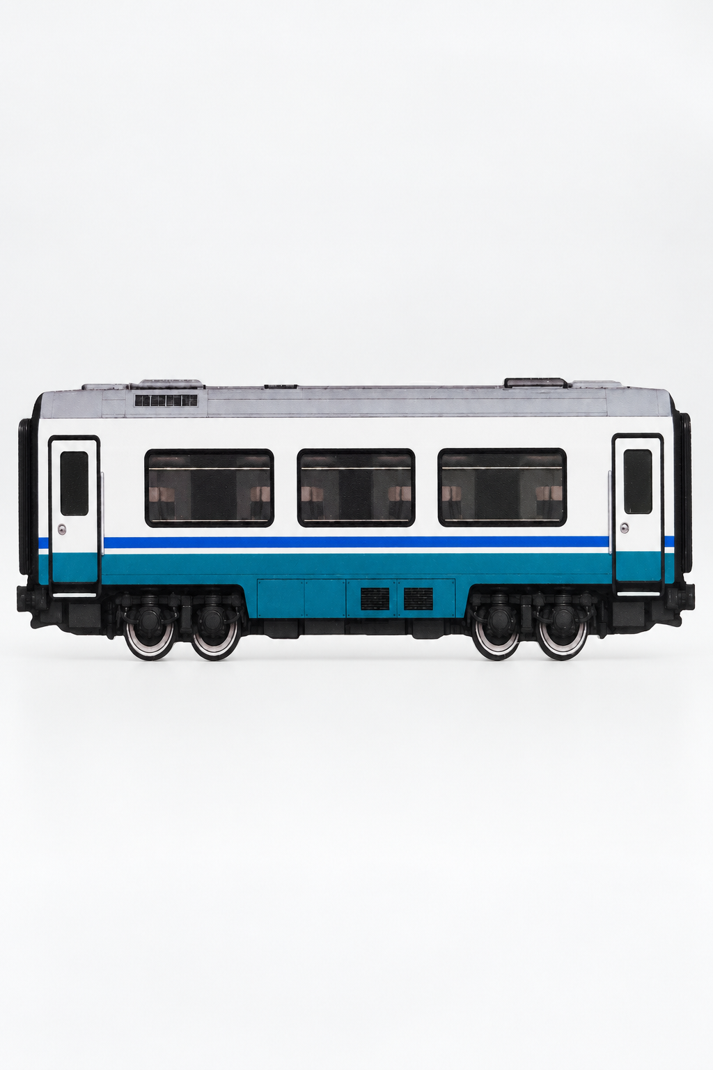
A 3D graffiti practice train sits between a sketch surface, a physical urban-art object and a display piece. That combination is useful, but it can also create the wrong expectations. It is not the same thing as a conventional scale-model railway coach, and its approximate overall dimensions do not translate into one uninterrupted rectangular painting area.
The CHROMATICA German Intercity Graffiti Practice Coach is a 3D-printed polymer object with a direct UV-printed design on both sides. Its overall format is approximately 20 × 10 cm, it is compatible with acrylic paint markers, and a display stand is included. The coach is a stylized, independent interpretation of a generic German intercity passenger-coach silhouette rather than a scale-accurate reproduction of a specific rail vehicle.
Before choosing this format, consider what you actually want to do with it: develop lettering, compare color ideas, create two finished sides, build a small collection or turn a painted study into an object for display. Those goals lead to different decisions about composition, detail and how much of the printed coach design you leave visible.
What a 3D Graffiti Practice Train Is
A practice train gives railway-inspired graffiti work a physical surface. Instead of drawing a coach outline on plain paper, you work directly over a printed train interpretation with a defined silhouette and recognizable visual structure. This creates boundaries that influence the piece: the available length, the height of the body, the position of printed features and the overall relationship between lettering and vehicle form.
The object can support several distinct uses:
- Graffiti practice: testing letter width, spacing, outlines, fills and color relationships.
- Composition studies: planning how a piece, throw-up or tag sits across a passenger-coach layout.
- Two-sided artwork: treating each printed side as a separate design surface.
- Display: presenting a completed piece as a freestanding urban-art object with the included stand.
- Collecting: keeping the coach unpainted, painting one side only or building a group of individually designed objects.
The key word is practice, but that does not mean every result has to be disposable or unfinished. A side can begin as an exercise and become a display piece if the composition works. Equally, a painter may deliberately use the object for quick studies rather than trying to produce a polished miniature artwork.
Practice Object or Scale Model: The Key Difference
A conventional model train is usually judged by how closely it reproduces a particular real-world vehicle: numerical scale, body proportions, technical details, markings, running compatibility and accuracy to a named prototype. Those are not the criteria for this practice coach.
This object is not scale-accurate and is not presented at a numerical model-railway scale. It should be assessed as a stylized, paintable rail-art surface. Its purpose is to provide a recognizable coach form that can carry graffiti lettering and color, not to recreate every feature of a specific passenger vehicle.
| Selection question | 3D graffiti practice train | Conventional scale model |
|---|---|---|
| Primary purpose | Painting, lettering studies, display and collecting | Prototype representation, layout use or model collecting |
| Scale expectation | Stylized and not scale-accurate | Usually associated with a defined numerical scale |
| Surface use | Designed to be painted with acrylic markers | Not necessarily intended as a graffiti practice surface |
| Vehicle identity | Generic German intercity-coach interpretation | May reproduce a named operator, model or vehicle |
| Display approach | Included stand supports presentation as an art object | May be displayed on track, in a case or as part of a layout |
This distinction matters most when buying for someone else. A railway model collector looking for an exact prototype may not want a stylized practice object. A writer or urban-art collector, on the other hand, may value the paintable format more than technical railway accuracy.
What the Approximate 20 × 10 cm Format Allows
The coach has an approximate overall format of 20 × 10 cm. Treat those figures as the size of the object, not as a guarantee of a full 20 × 10 cm uninterrupted painting rectangle. The silhouette and printed coach elements create the actual compositional field.
At this size, every decision becomes more visible. Letter spacing that feels acceptable in a large sketch can become cramped on a compact object. Heavy outlines, oversized highlights and multiple background effects can quickly compete for the same area. The format rewards editing: deciding which parts of the piece matter and removing effects that do not help the letter structure.
The available length suits several approaches:
- A short name or compact letter combination stretched horizontally.
- A throw-up with clear, economical letter construction.
- A sequence of tags or handstyle variations.
- A focused two- or three-color relationship study.
- A panel-style composition that deliberately responds to printed coach features.
- A cropped or partial piece in which selected letters extend beyond the implied panel.
Long words, highly complex wildstyle structures and effects-heavy backgrounds are still possible as ideas, but the compact format requires tighter planning. If the design depends on numerous small internal cuts, thin connections and multiple outline bands, readability may suffer. Reducing the word, enlarging the main letters or simplifying secondary effects usually produces a stronger result.
Nib choice also changes the practical scale of the work. A broader acrylic marker can establish fills and large shapes efficiently, while a finer nib can support outlines, corrections and small accents. That does not mean the smallest available detail is always desirable. Tiny features may look busy when the object is viewed from normal display distance.
How to Use the Two Paintable Sides
Both sides are printed and paintable, so the coach provides two related surfaces. They can be treated as independent designs or as two parts of one concept. Before starting the first side, decide whether preserving the second side matters to your plan.
Use each side as a separate exercise
This is the most practical option for skill development. Repeat the same name on both sides while changing one variable at a time. For example, keep the letter structure consistent but compare two fill palettes. Alternatively, use the same colors while changing the outline weight or letter spacing. A controlled comparison teaches more than changing every element at once.
Create a sketch side and a resolved side
One side can hold a quick, direct interpretation; the other can carry a more considered version. This is useful when you want the object to record part of the development process. The practice side does not have to imitate a paper draft—it can simply use fewer colors and fewer finishing effects.
Build one concept across both sides
The two sides can share a palette, word, crew abbreviation or visual theme without being identical. One might use straight letters and the other a throw-up. One could emphasize warm colors while the other reverses the hierarchy. This creates a coherent object that changes when turned around.
Paint one side and preserve the other
Leaving one side unpainted keeps the printed coach interpretation available for comparison. This can be valuable for collectors or for anyone interested in the relationship between the original surface and the applied artwork.
Remember that the reverse side can come into contact with your table or hand while you work. Plan the sequence rather than moving immediately from one side to the other. Follow the acrylic marker manufacturer’s instructions for use and drying, and avoid resting a freshly worked side against another surface.
Which Graffiti Exercises Fit the Coach Layout
The format is most useful when the exercise has a clear purpose. “Fill the whole side” is a possible brief, but it does not automatically teach composition. A more specific constraint makes it easier to evaluate the result.
Letter-width and spacing study
Choose a short word and assign most of the available horizontal space to the letters. Mark the approximate beginning, midpoint and end of the composition before filling anything. The goal is to avoid compressing the final letters after the first letters have taken too much room.
Outline hierarchy
Use a simple fill, then test how the piece changes with an initial outline, a larger outer border or selected emphasis around key letter connections. On a compact coach, outlines can consume a significant portion of the available field. This exercise shows where extra weight improves separation and where it overwhelms the fill.
Throw-up economy
Build a throw-up with as few strokes and internal divisions as possible. Focus on rhythm, repeated curves and the balance between letters. The physical coach format makes inconsistencies easy to spot because the word is seen as one horizontal unit.
Limited-palette study
Select a small palette and assign a role to each color before painting: fill, outline, shadow or highlight. A restrained palette reduces indecision and makes it easier to judge contrast. It also prevents every available effect from being added simply because there is an unused marker nearby.
Feature-aware composition
Instead of ignoring the printed coach design, decide how the artwork should relate to it. You can allow selected printed elements to remain visible, place letters around them or cover parts of the underlying design as part of the composition. There is no single correct level of coverage. The important point is that visibility or concealment should look intentional.
Side-to-side variation
Repeat the same letters on both sides with one planned difference:
- light fill versus dark fill;
- straight letters versus rounded letters;
- single outline versus layered outline;
- high contrast versus closely related colors;
- centered placement versus deliberately cropped placement.
This is particularly useful when deciding which choices remain readable on a small rail-inspired surface.
What to Know About the 3D-Printed and UV-Printed Surface
The object is made from 3D-printed polymer and carries a direct UV print. These are separate parts of its construction: the 3D-printed object provides the physical form, while the printed design establishes the coach appearance on both sides.
That makes the working experience different from using a blank sheet of paper. You are painting over an existing image rather than beginning with an empty white field. The underlying colors and linework may remain visible around the piece or influence how a chosen fill appears visually. Opaque coverage, line behavior and drying can also vary between acrylic marker brands, colors and nib systems, so follow the instructions supplied with the markers you use.
A practical workflow is to move from broad decisions to small ones:
- Inspect both sides. Identify the areas you want to cover and the printed details you want to preserve.
- Plan the word at full proportion. A quick paper sketch can help, but adjust it to the coach’s horizontal shape rather than copying it mechanically.
- Establish the major letter shapes. Avoid committing to highlights and background details before the main structure works.
- Build the color hierarchy. Separate fill, outline and any shadow or border clearly enough for the size.
- Add details selectively. Use accents to clarify form, not merely to occupy remaining space.
- Allow the work to dry according to the marker instructions. Handle and turn the object with the opposite side in mind.
- Evaluate it on the stand. A composition can read differently when upright than when viewed flat on a worktable.
Do not assume that an unwanted mark can be erased or removed cleanly. The product is intended as a paintable surface, but clean removal, reset or repeated repainting has not been established. If permanence of a particular decision concerns you, resolve it in a preliminary sketch before applying it to the object.
Using Acrylic Paint Markers Without Assuming Other Tool Compatibility
Acrylic paint marker compatibility is verified for this practice coach. Compatibility with alcohol markers, oil-based markers, solvent-based inks, refill inks, spray paint or other media should not be inferred from that statement. Different paint and ink systems can interact with a printed polymer surface in different ways.
Within the acrylic marker category, choose tools according to the job:
- Broader nibs are useful for fills, large blocks and uncomplicated background shapes.
- Medium nibs suit primary outlines, compact lettering and controlled color sections.
- Fine nibs can support interior lines, small highlights and selected finishing details.
The most useful set is not necessarily the one with the greatest number of colors. A small group with clear roles often produces a more coherent piece. Consider one fill color, a contrasting outline, an optional border or shadow and a restrained highlight. If the fill itself uses several colors, simplify the effects around it.
Marker preparation and drying times vary, so use each marker according to its manufacturer’s directions. Avoid assuming that one acrylic marker brand behaves exactly like another. The product’s compatibility establishes the appropriate media category; it does not guarantee identical opacity, flow or finish across every marker and color.
How the Included Stand Supports Display
The included stand allows the coach to be presented as a freestanding object rather than remaining flat like a sketch. Its main function is display: supporting the finished or unpainted coach so the artwork can be viewed upright.
This matters during the design process as well as after it. A side that looks balanced from directly above may feel top-heavy, too detailed or visually empty once placed upright. Evaluating the work on the stand can help you judge:
- whether the word reads clearly from a normal viewing position;
- whether small highlights contribute anything at display distance;
- whether the artwork feels centered within the silhouette;
- which side should face forward;
- whether both sides belong to the same visual concept.
The stand also makes it possible to rotate the object when you want to change the displayed side. If the two designs use different palettes or lettering styles, the same object can present a different character depending on its orientation.
No outdoor, weather-resistant or conservation-grade display properties should be assumed. Choose the coach as an indoor art and practice object unless separately verified information states otherwise.
Understanding the Generic German Intercity-Coach Interpretation
The visual reference is a typical German intercity passenger-coach silhouette. It is an independent artistic interpretation designed to communicate the general character of that type of rail vehicle without identifying a specific protected train model or operational vehicle.
The coach does not carry official operator logos, company names, protected model names, route markings or vehicle numbers. It is not affiliated with, licensed by or endorsed by any railway operator or vehicle manufacturer.
For a buyer, this means the object should be chosen for its generic German passenger-rail character, its paintable surface and its role in urban-art practice—not for exact correspondence with a named operator, route, fleet or railway model. That independent status also keeps the focus on the artwork applied by the user rather than on official railway branding.
Is It Better for Practice, Display or Collecting?
It can serve all three purposes, but one priority should guide the choice.
Choose it mainly for practice if you want a compact physical surface for lettering, throw-ups, tags or color studies. The two sides are especially useful for comparisons and repeated exercises.
Choose it mainly for display if you want a completed graffiti piece to exist as an object rather than only as a drawing. The included stand supports this use, and the two-sided format allows the visible design to be changed.
Choose it mainly for collecting if the combination of passenger-rail form and urban-art potential is more important than scale-model accuracy. It can remain unpainted, be painted on one side or become a fully worked two-sided piece.
The format is less suitable if your main requirement is a technically accurate railway miniature, a specified model-railway scale, official operator markings or verified compatibility with media other than acrylic paint markers.
A Practical Checklist Before Choosing This Format
- Do you want an art surface rather than a scale model? The coach is stylized and not scale-accurate.
- Does an approximate 20 × 10 cm overall format fit your working style? Expect a compact composition rather than a large, uninterrupted panel.
- Can your lettering be simplified when necessary? Short words, throw-ups, tags and focused color studies suit the format particularly well.
- Will you use acrylic paint markers? That compatibility is verified; other ink and paint systems should not be assumed compatible.
- Do you have a plan for both sides? They can hold separate exercises, paired designs or one painted and one preserved surface.
- Do you want to display the result upright? A stand is included for presentation.
- Are you comfortable with a generic railway interpretation? The object does not represent an official operator, protected model, route or numbered vehicle.
- Is your priority practice, display or collecting? Decide this before painting so the amount of planning and finishing matches the intended use.
A 3D graffiti practice train is most useful when its limitations are treated as part of the exercise. The compact body forces decisions about scale, spacing and visual hierarchy. The printed coach structure gives the letters a context, while the two paintable sides make comparison and variation possible. Chosen for those qualities—not for model-railway precision—it becomes a practical bridge between a graffiti sketch and a finished urban-art object.